
The Painter's palette vs The Carnival III Love Tahiti palette
- Neah Ivanna

- Sep 8, 2020
- 4 min read
Both beyond colorful and sum up a large portion of my August favorites. Let me begin with this, both palettes are a must in your makeup collection. However I still have certain points to make on each and I'll discuss them below.
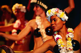
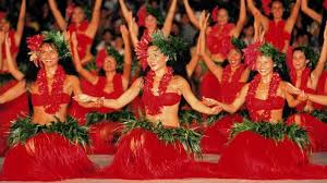
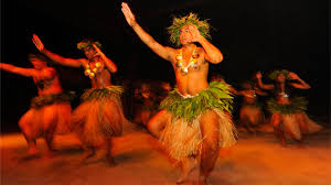
Carnival 3 palette

This palette I set my alarms for and was browser ready. It's a super anticipated palette created by the @StaceyMariemua and her other collections have been amazing. There was an early release date, launch date and back in stock date. Each time this bad boy was sold out and I was lucky enough to get it on launch date.Not for nothing but i do not play with makeup launch dates like I have six alarms, two computers and my phone ready to process orders.
This is her third installment and I'd say it contained a lot more vibrant mattes than the others as well as warmer color tone. The consistency of the shades are pretty rich and haven't stained so much. (I have yet to use the pink shades.) It's easy to pack on any color and I say using smaller denser brushes really provide the maximum payout with it.

I definitely appreciate the transitions of shades in this collection like the plays with oranges, yellows and greens. I feel like most palettes will have one shade of a yellow or a green because people tend to avoid them. More so, they are shades that are seen to be too creative so it's avoided. Also, I love that pink shades take up most of the color selection in this palette while giving us enough matte and duo-chrome/glitter play.
The palette is heavy and has a fun cover appearance. It feels like a floraled Zebra but I'm not sure what that has to do with Tahiti. However the color story very much gives me the Tahitian feels because there's loads of vibrancy and warmth whether it's a blue or purple shade. The color selection does make it a great summer palette
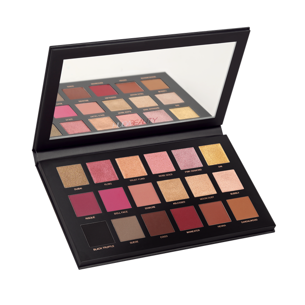
Painter's Palette

Let me tell you that this one definitely had me pretty excited. This palette was created by sample beauty and @bethpaintermakeup. It's called the painter's palette and definitely gave me that vibe. It felt kind of personal because there was a quotes written on the mirror. It says,
"Art enables us to find ourselves and lose ourselves at the same time" by Thomas Merton.
The quote is also written o the back of the palette and @Bethpainter expresses why this is written. She states,
I designed this palette for you to feel just that. This quote is printed on the mirror inside of the palette, to remind you of the message every time you open it and start painting. This palette fuels my creativity and I hope it does the same for you."

To my knowledge this is her first collaboration and felt like a gift. I did appreciate the touches of quotes and the palette being describes as paint. As a makeup artist you use your client's as canvases and shadow as paint. It felt super personalized although there's millions of these available for purchase. The quote just reminds me how lost I get when I'm creating a look; I get lost in my zone.
Similar to the Carnival 3 there's a load of colorful mattes but some traditional colors. She didn't include too many duochrome or glitters which I am not too much a fan of. However I didn't really notice when I was using it. These shades were so creamy and rich. Like, when I blended colors or fused some together it melted so easily.
Not that it went into the skin or disappeared but more like everything paired so easily. As for the color selection, I found it to be a uniformed taste of all colors. I don't know why but the cool pink and the almost pastel/vibrant yellow works well together. I DID DESPISE SEEING THE SHIMMERY BURGUNDY THAT'S IN ALMOST EVERY GENERIC PALETTE. To me, that's a waste of a shade because it's seen everywhere.
Also, I did like how shades were paired in threes. There's enough browns if you just want to do an all neutral eye or if you'd like to do the same with blues it's possible. Monochromatic looks can happen here and if you'd like to keep the same color story but switch it around you can. For example, you can used shade leo, pumpkin, summer and add a pop of gemini. Lastly, there's the opaque whit, darkest black and sparkly silver. I gagged over these shades because it pays homage to my makeup beginnings. (only a smokey eye was ever worn.)
The gif is not a reflection of the shadow but more of how I looked with a smokey eye aeons ago. Any who the black is rich and smooth no patches in sight. It glides so perfectly and easily. I'd say these shades reminded me of painting strokes because of how the shades can move.
Which is better?
I know I said I wouldn't choose but I'd say the "painter's palette" was so personalized and I do like the shadow ingredients more. Then again the Carnival 3 color selection is unbeatable and there's sparkles. To be honest both palette's had wonderful loud mattes that aren't patchy. If I could fuse them together I'd want Beth's personal touch, sample beauty's shadow ingredients but Stacey's color story.
Both palette's do show several differences in colors and how there's a million different greens oranges and purples. It definitely made me feel like I made a great addition to my make up collection and didn't make impulse buy.

Also, please comment what you loved. most about these palettes or why you avoided these releases. Please like, comment or share is post and make makeup fun again. Until next Tuesday babies!


Comments